#25 - Flynn Rider - Tangled
Flynn Rider was a breath of fresh air for the token prince/love interest in princess´movies. Instead of going for a perfect-guy kinda type, the creators wanted him to be sarcastic, rebellious, and maybe a bit too much full of himself. Not only this made him feel more realistic and fleshed out as a character, but also helped to give him some development on-film, as he needed to have a change of heart and humble himself.
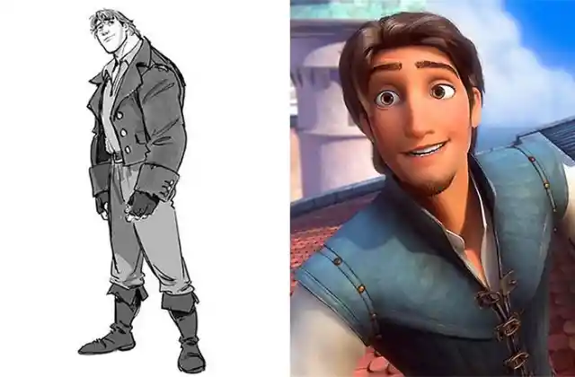
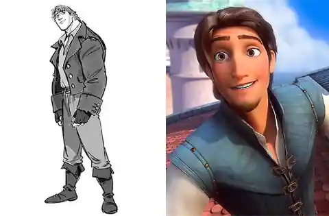
When it came to his design, animators went on to a sacred quest, the ultimate "dashing thief", and allegedly invited all the women into a meeting wherein they would share their ideal type of guy. From this combination and brainstorming, came out the character we see today. Funny enough, some fans claim he looks like a mix of Tulio and Miguel, from Dreamworks´ The Road to EL Dorado. But don´t worry! His original design, also very charming, did not go to waste! You can still notice many traces of it in the final design of Frozen´s Kristoff.
#24 - Pocahontas
> "the most idealized and finest woman ever made" > This was the premise when Glen Keane was tasked into designing Pocahontas for her eponymous film. And he took it SERIOUSLY, going so far as to contact actual descendants of the real historical figure, to meet them in person and inspire his depiction. For this, he went to Virginia on a research road trip.
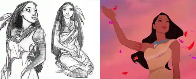
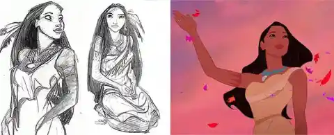
However, after seeing a portrait of Pocahontas and finding out how the real person used to look like, he decided to go for another source of inspiration, using popular models as references. From this, he claimed that, sadly: > "(she was)not exactly a candidate for People's 'Most Beautiful" > * The movie was idealized and rather detached as it is from the original history, so, doing the same for their main character wouldn´t hurt, right?
#23 - Alice - Alice in Wonderland
We all know the famous tale of Alice in Wonderland, written over a century and half ago by Lewis Carroll, a story which actually consists in two books. This much beloved story was adapted into films over and over, it´s seen itself reenacted in living actors, puppetry and animation, in black and white and color, by pros and amateurs... But the Disney version will be by many the most memorable. And we owe all of this to Mary Blair.
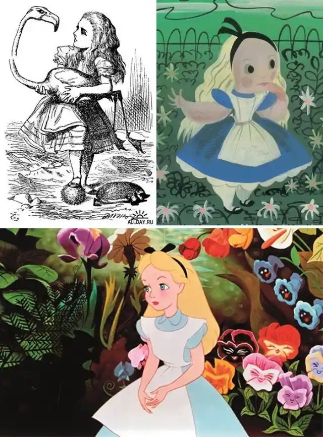
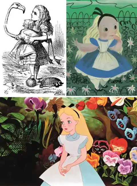
Walt Disney, he loved Mary Blair, he loved her art. She made concept art for everything back in the day, from Cinderella to Peter Pan, from The Sleeping Beauty to Alice in Wonderland. And it´s in these two that her style SHOWS. Because Disney wanted more than anything for Blair´s style to make it into the silver screen. While Alice´s style is overall rather simple and strictly respectful of Disney´s House Style, Blair managed to imbue her and her world with color, shape, and energy, which is why the art of these films is a MUST in any Disney´s fan library. Just a minute... House Style? What would that mean?? We´ll get to that in a moment, so keep reading.
> "When Disney villains go to college to learn how to be Disney villains, they pass Maleficent’s statue in the courtyard." > Neil Sharpson AKA The Unshaved Mouse, professional writer and movie reviewer commenting on the impact of Maleficent. She was a game changer through and through, everything, from her design to her voice, from her pitch black heart to her regal way to carry herself on screen. And it took A LOT of tries to get Maleficent JUST RIGHT.
#21 - Jasmine - Aladdin
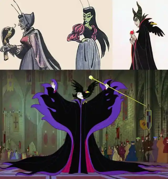

> "Sometimes teamwork isn't easy." > We have Marc Davis to thank for the Maleficent we know today, and not only her design. But there were many disagreements and clashing preferences along the way to get the results that would make everyone happy. Regardless, they made it. This movie was a huge risk for Disney, which was betting every last cent on it. But THEY MADE IT. We are talking about the dark days of Disney, where their wealth relied entirely on the success of their movies, where everything HAD to be perfect in order to do justice to their vision while having the audience love it and make their masterpieces profitable. And Maleficent was the character, the villain, who would not only help Disney as a whole carry on, but also someone to be forever remembered as one of, if not the best and most memorable characters of the Disney Canon.
In Aladdin, many of the characters (with the deliberate exception of Jafar) are designed around round, soft, friendly looking curves, that evoke and match the layout of their kingdom. Everything there, from the bazaar to the palace, is based to look like arabian calligraphy, and the Taj Mahal, and makes everything fit just right.
#20 - Mulan


This is why Jasmine´s design, from her clothes to her hair and even earrings, is soft and round and harmonious. A complete difference from her first designs, which only makes sense, as her character was completely rewritten from being a typical spoiled princess who only cared about clothing and jewellery, to becoming an independent and fiery character who won´t stand for those who want to take advantage of her.
> "you can't pass as a man in the army with a Barbie-style figure." > When it comes to Mulan, designers had to come with a look that was appealing for the audience, especially the kids who would later want to purchase the dolls and other merchandise, but also had to be "convincing" in a way, as to not make Mulan´s design too feminine-looking, as otherwise she wouldn´t have been able to pass as Ping when she joined the army.
#19 - Aurora - Sleeping Beauty
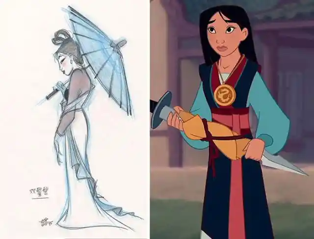

As she is also based in a canonical historical figure, Hua Mulan, she also had to look like a young chinese woman from the 4th-6th centuries. She also needed to be brave, courageous and honorable, and her character had to transmit all of that at all times. Of course, she also received a nice dose of clumsiness, which in many people´s opinion makes the character a lot more likeable.
While we could argue that Mulan is one of the most active Disney Princesses of the list, the entirely opposite could be said for Aurora. Sadly, she became a sort of minor character in her own movie, vastly undefined, and completely overshadowed by Maleficent and the Fairy God Mothers.
#18 - King Triton - The Little Mermaid
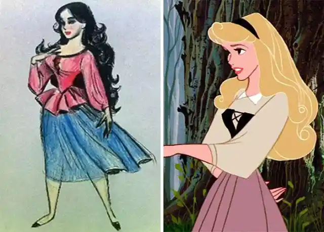
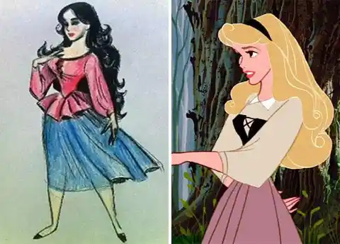
We can accept this for one very important factor, though. The movie was released in 1959, and as such, it was only Disney´s third feature film so far. There was still a lot of growth to be done for everyone involved. It would take decades to start pushing Disney Princesses into being strong and witty and fighting for what they want. When it comes to her design, Aurora, as per usual at the times, was designed and animated around references made by real people, which meant their appearances weren´t quite as cartoonish as what we are used to nowadays. In this case she can thank her looks to Audrey Hepburn. Her designer was Marc Davis, who previously designed Cinderella and Snow White.
When it comes to King Triton, Ariel´s father, you´d think that his royal status would make the designs go more smoothly and be more straightforward. In this case, however, it wasn´t that easy. He was indeed envisioned from the beginning as a large, muscular, and imposing man who makes you certain the title of King of the Sea must be earned in a wrestling match. But there was still something missing...

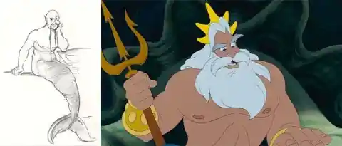
It took him quite a while to earn his crown, golden gauntlets, and, more surprisingly, his large and flowing white mane and beard, which not only makes him look more regal and refined, but also wiser and -ironically- more humane. Prequels of the movie even show us that he used to have red hair, just like his troublemaker youngest daughter. She certainly takes a lot after him.
Famous animator and director of Tangled, Glen Keane, must be very proud, as his own daughter, Claire Keane, was the mastermind who not only successfully followed his footsteps, but also made one of the most beloved Disney Princesses we have to date. He even said that: > "Rapunzel's personality was very much based on Claire's childhood persona." > Rapunzel was not lacking minor edits here and there over the course of her development, but here is one case where the first designs were quite close to the mark.
#16 - Carl Fredericksen - UP

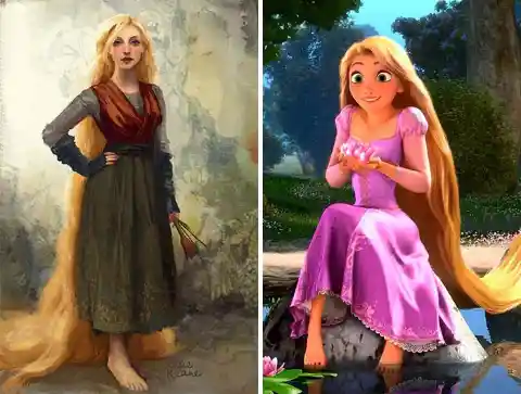
> "While working on Tangled, I wanted to better understand the character of Rapunzel and what she did all day so I kept a journal of the things I did at home and translated it into Rapunzel’s world." > Says Claire, who completely immersed herself on this task to make Rapunzel act and feel very real, while still being daredevil and adventurous despite her fears. > "Rapunzel became somebody I could relate to even though our circumstances were worlds apart." >
We are now in the year 2006, and we have some groundbreaking news to share: Pixar merges into Disney! Reactions are mixed, as Pixar is considered more daring and adventurous, and likes to play much more with the possible stories and the designs of the characters, whereas Disney is much more fond of doing their own version of the most beloved fairytales, and making them more family-friendly.
#15 - Ursula - The Little Mermaid
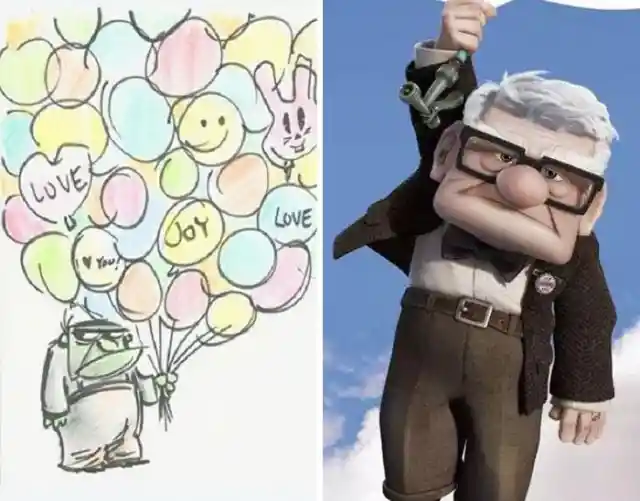
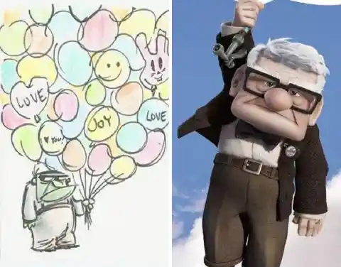
With Pixar comes a vast increase in the number of 3D animation, one of such examples being UP. And here is where we see Pixar doing what they do best. We look at our main character Carl, he´s a very short, very square man. But Pixar makes it work! Carl was never designed to resemble an average person in any way, and thanks to Pixar´s magic, we have a grumpy yet endearing, very square and small old man, going in larger than life adventures! And we love it!
At first, Ursula was envisioned as a "tall, thin regal-looking sea witch", based on a scorpion fish. Overall, her design severely lacked charm, appeal, and her miserable past of being banned from the Palace and wanting revenge on King Triton wasn´t working if we as an audience wanted to feel interest towards her.
#14 - Esmeralda - The Hunchback of Notre Dame
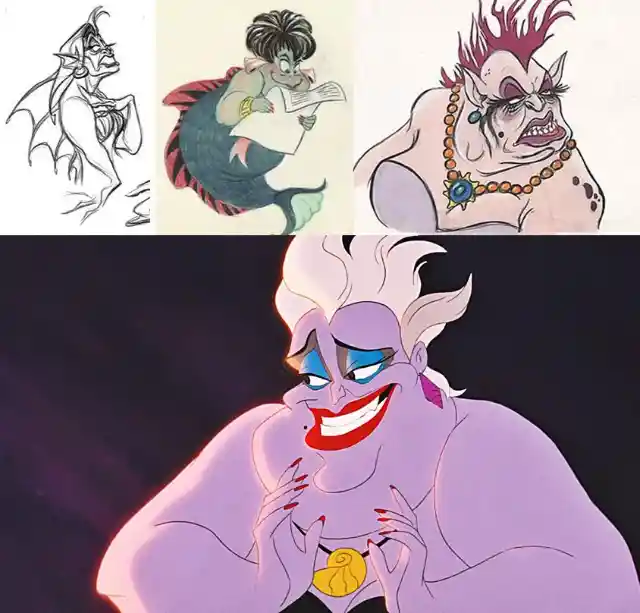

But the path to landing the right design came to a positive turn when Glen Keane discovered drag queen Divine, and took inspiration for Ursula. Now, with the mental image of a "vampy overweight matron", the drawings were going in the right direction. Ursula was rebranded as a temptress, a sly woman who used her wits to trick sweet naive Ariel, and many others, into signing a contract with her. She became dangerously efficient both with the cast and the audience, and even today many people adore her and claim she´s their favorite villain. And a lot of this can be attributed to her unusual yet gorgeous design.
Back in 1996, Disney chose to adapt Victor Hugo´s novel, The Hunchback of Notre Dame, into an animated feature. This is quite the choice, as the book and the author are well known to be known quite... Risqué. This movie had mature themes in many aspects, but more important than any other was the huge religious themes of the movie, and the discrimination the Roma people (which many usually refer to, but shouldn´t, as Gypsy), including our leads Quasimodo and Esmeralda.
#13 - Belle - Beauty And The Beast

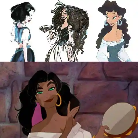
> "Esmeralda is verbally powerful, street-wise, cunning, and morale. She was the sole individual in all of France to downright rebel against Frollo" > Esmeralda was quite hard to get right. For one, she was aged up from the book for obvious reasons. She also had to have a good balance between her fiery and righteous side, her cunning and tricky side, and the sweet and caring side, as many of these aspects were needed for her survival within the story.
We´ve mentioned earlier the Disney House Style. And here, this topic is relevant again: Have you noticed how most Disney Princesses have rather basic features? If you look at Wendy, from Peter Pan, she looks almost exactly like Alice. And this is why: When creating a movie, every single artist and animator will have their own personal drawing style. It´s only logical. But, equally logical, is that when everyone comes together to draw all the scenes in the movie, the characters have to look consistent from start to finish. And this is why is so much simpler and easier to set for designs that are extremely basic. Such is the case with Belle:
#12 - Cruella De Vil - 101 Dalmatians
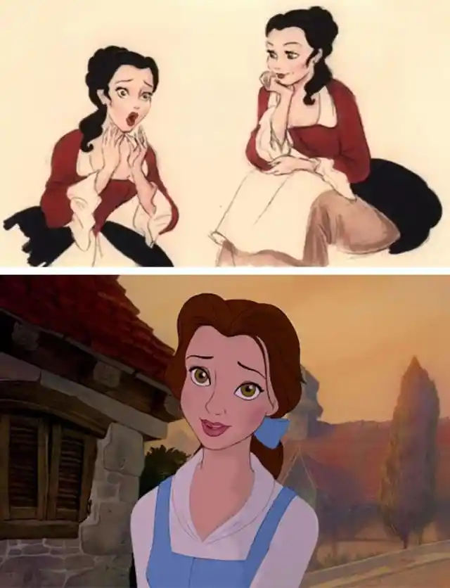

Especially because her romantic interest was none other than the Beast, whose elaborated and strange appearance deserves an entry of its own, which, btw, we´ll tackle in just a moment... Belle´s design was meant to look rather simple. At the same time, Belle had to look attractive enough to be fancied by Gaston, despite being able to settle for any other girl in the village. Yet, keeping her basic and simple, down to earth, and of course, likable enough that people would want to buy dolls designed after her. At times like this is when the House Style is the go-to solution.
In 1956, British author Dodie Smith published the novel 101 Dalmatians, and a mere 5 years later, it was adapted into a charming and memorable Disney movie. While equally memorable, yet nowhere near as charming, Cruella made her debut on the silver screen, and, true to her name, is remembered even today as being cruel and relentless, especially for pet owners and animal lovers who would never even dare to think on harming our furry friends.
#11 - The Beast - Beauty And The Beast
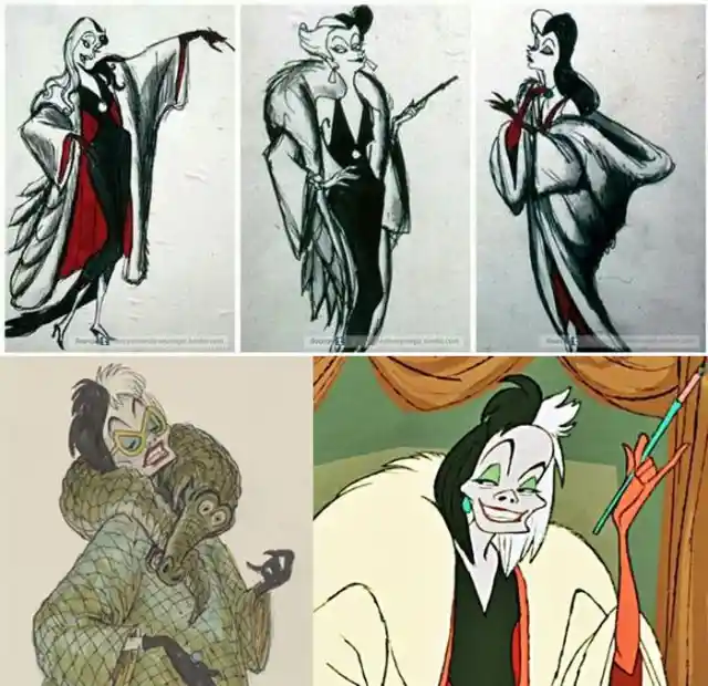

As we can see on the concepts above, the road to making her iconic design was more or less concise from the very beginning. She was a wealthy, pompous, glamorous London heiress who loved furs with a passion. The key was to show what was behind all those luxurious pelts: A bony, emaciated woman who desperately wanted something to fill her life with. The designer behind her was Marc Davis, also renowned for designing Maleficent and Tinker Bell.
> "The animators drew him with the head structure and horns of an American bison, the arms and body of a bear, the ears of a deer, the eyebrows of a gorilla, the jaws, teeth, and mane of a lion, the tusks of a wild boar, and the legs and tail of a wolf. " > As you can imagine, a lot of effort and research were needed to come up with the ultimate design for The Beast, whose real name is Adam, by the way. He had to look terrifying when angry, but adorable when happy. There were a lot of emotions this character had to express, and they all needed to work
#10 - The Evil Queen - Snow White And The Seven Dwarfs
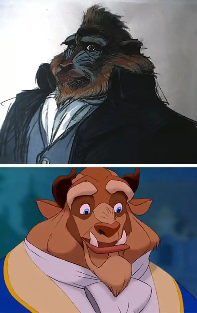
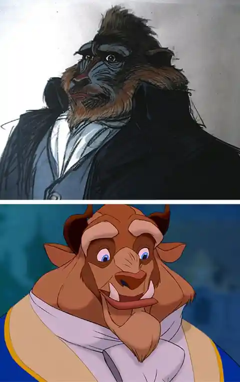
> "There's a rage and torment in this character I've never been asked to use before." > Commented Glen Keane, who was in charge of polishing the final sketches of The Beast, for which he had to go to the zoo and study the animals he was based on. And equally important was coming up with an extremely fitting voice, a task that Robby Benson did with flying colors. His voice suited The Beast in all aspects like a glove. All this hard work, while on a rush, earned the movie over 400 million dollars, the highest grossing animated film at the time. And The beast continues to be an incredible character design that has yet to be topped. And if you thought all the trials and errors to get The Beast right, wait until you see how Gaston looked at first!!
> Lucille LaVerne voices both the Queen and her aged alter-ego and they’re both fantastic, iconic and terrifying in very different ways. The Queen is a study in icy restraint, rarely raising her voice above a harsh whisper. It’s only when she drinks the potion and transforms into the Witch that she allows herself to cut loose and it’s a darkly delicious delight." > Neil Sharpson, AKA, Unshaved Mouse, on Queen Grimhilde (Yes, that is her real name) Snow White And The Seven Dwarfs is the first Disney animated movie, therefore making The Evil Queen/The Old Hag the first villain/s of the Disney canon. Let´s see how they were created
#9 - Aladdin
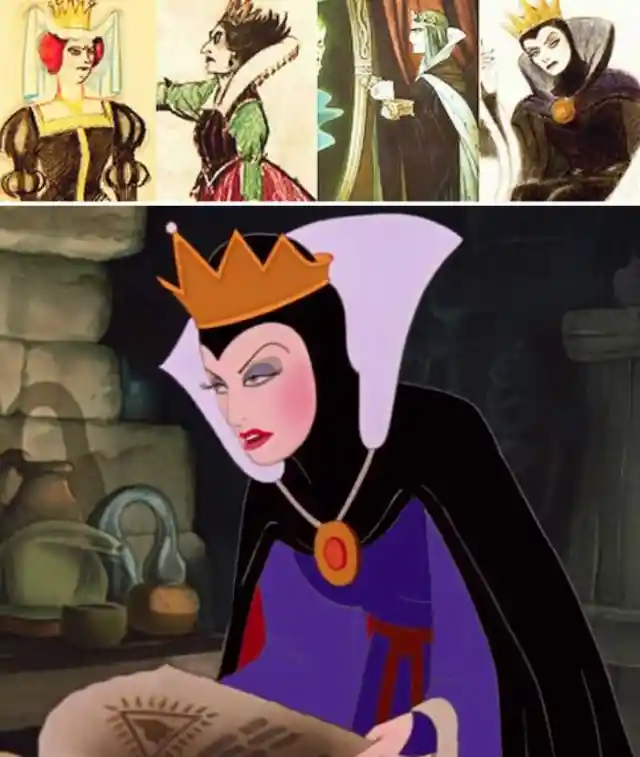
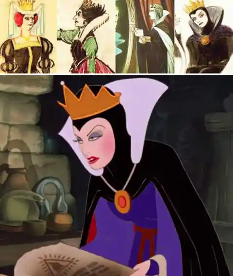
Disney originally envisioned the queen as a "fat, batty, cartoon type, self-satisfied", an idea that would have not worked, and was instead saved for characters like The Queen of Hearts in Alice in Wonderland. After much discussion, the team, lead by the very own Walt Disney, settled for a mixture of Lady MacBeth and The Big Bad Wolf. > "a high collar stately beautiful type whose beauty is sinister, mature, plenty of curves – she becomes ugly and menacing when scheming." Maybe some of us, confused as kids as to why The Queen, who loved beauty above all, would make herself a horrible Old Hag on purpose; finally got our answer in our own selves as we reached adulthood and found comfort and liberation when we dropped ridiculously high standards we set for ourselves. Especially if said standards involved plotting to kill our 14-years-old stepdaughter for being prettier than us... Oh, wait, I think this only applies to The Queen.
Unlike many of the Disney Princesses stories so far, which are usually taken from the collections of the Grimm Brothers, Aladdin is heavily inspired in the Middle Eastern folk tales "One Thousand and One Nights". This story is also different, mostly because, while the princess Jasmine is indeed very important for the movie, the lead is given to her romantic interest, Aladdin. Many changes were made from the original tale to the movie, some of them completely understandable. Otherwise The Genie would be able to grant INFINITE wishes. But let´s focus on our lead:
#8 - Ariel - The Little Mermaid

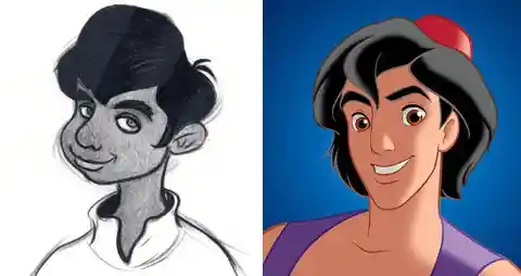
Originally, Aladdin was meant to have an appearance more suited for the setting of the movie, which is the fictional city of Agrabah, somewhere in the middle East., as we can see in the left picture above. However, the design was revised, as it was decided to base his appearance more in current teenage pop idols, as he is implied to be a teenager, or at most a young adult, himself. The animators wished for him to be athletic-looking and teen-hunk... Their words, not mine. All in all, his final appearance looks rather ethnically ambiguous, which, when contrasted to Jafar´s VERY caricaturesque portrait of clear arabian inspiration has... Made some concerned fans voice their opinions. All in all, the movie was a HUGE success, and a personal fan-favorite.
> "I heard Part of Your World, Jodi Benson singing that, and it just captivated me. I have to do that. And I went and told those guys, 'I really wanna do Ariel.' And they said, 'Well, I don’t know. This is supposed to be a pretty girl. Can you do that?' I said, 'Look, I have to do Ariel. I mean, I can feel it in my heart.'" As Glen Keane made quite evident here, he was more than on board with being in charge to designing one of the most popular characters OF ALL TIME. And this is not exaggeration. Ariel made history. Here´s why:
#7 - Snow White - Snow White And The Seven Dwarfs
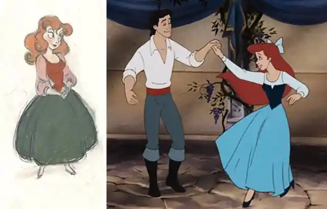

First of all: Ariel´s physical design. She was the first Disney Princess that didn´t have a realistic human body type. And no, this is not meant to be a mermaid joke. She is the first cartoonish Disney Princess. Her body is very thin, so are her limbs, her eyes are very large... All of this reformulated how there would be more freedom in designing the female leads from now on, and this of course would affect heavily their merchandise too. She was also hot-headed, bratty and rebellious. A first for Disney Princesses as well, which so far have been petite and demure, more passive than active in their quests for what they want. And more importantly. The Little Mermaid was ridiculously popular. This movie made Disney so wealthy, that they no longer had to worry about the money! From hereon, Disney wouldn´t have to gamble all their funds or cut corners for every movie! The Little Mermaid, singlehandedly, saved Disney, and in an spectacular fashion! And all thanks to Ariel!
What we just described with Ariel, was exactly the opposite for Snow White. Walt Disney LOATHED the idea of her looking even remotely cartoonish. Before this, their first animated movie, Disney had released many animated shorts, called Silly Symphonies. Within them, all characters were cartoonish, and moved in unnatural ways, as if their limbs were made of rubber. Another classic example is the original Mickey Mouse cartoons. As charming as they are, Walt wanted none of this in Snow White, and, he would be extremely nitpicky about everything during the length of the production when it comes to Snow White´s design. A pain in the--- Excuse me, let´s continue:
#6 - Gaston - Beauty And The Beast
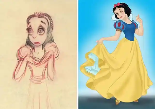

Dancer Margie Bell served as the live-action model for Snow White. She would repeatedly dance and perform actions, while illustrators would capture her movements as accurately as possible. When the time for choosing the voice came, over 150 girls were auditioned and rejected, until she finally found her voice in the least expected place: > > "Disney called music teacher Guido Caselotti, who wanted to offer to send their best to listen to the students, but it turned out that his 20-year-old daughter Adriana overheard a conversation on another phone in the house, and she began to sing in a young girl's voice. Her father was confused and told his daughter to get away from the phone, but the casting director liked her voice and invited her to audition. After Walt Disney heard her, he immediately gave her the role."
> No one... Gets so many strange attempts at nailing the final design as Gaston? > Seriously, I am as surprised as you are. When we think on his personality and goals: Being an amazing hunter, the hero of town, a macho... I certainly don´t have the mental picture that the first couple sketches went for. But maybe that´s just me.
#5 - Captain Hook- Peter Pan
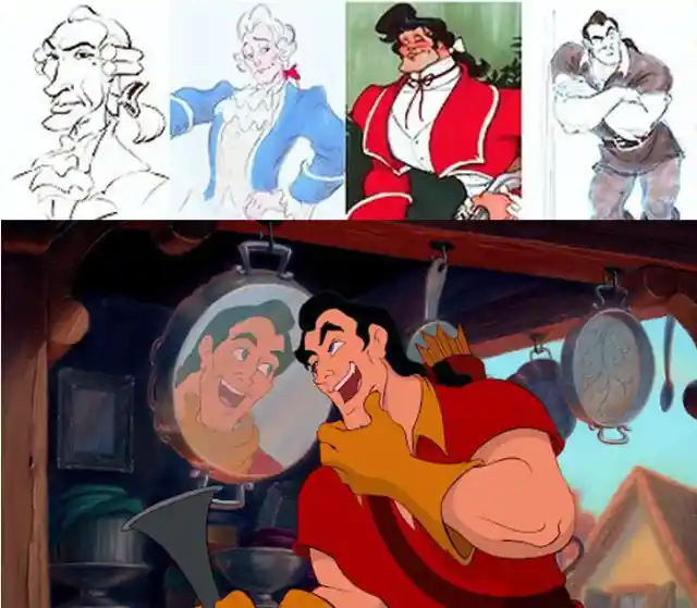
The creators had the task of making, for once, the Villain character intentionally handsome. Attractive and muscular, the heroine must be crazy to not fawn over him. And he must also serve as a foil to The Beast, handsome outside/ugly inside vs handsome inside/ugly outside. However, is it only at the end of the movie where he truly becomes villanous, before that Gaston was merely a narcissist who wanted to have Belle as his bride. Of course his inability to take no for an answer is quite the red flag.
> "A fop... Yet very mean, to the point of being murderous. This combination of traits should cause plenty of amusement whenever he talks or acts" When it came to portraying Captain Hook in Disney´s take on the story of Peter Pan, Disney decided to go for a mix between serious arch-nemeses and comedic relief. Additionally, he was good looking and well mannered, resembling royalty from Spain, this last detail was for his affably evil act on which he would trick Tinker Bell into revealing information to him.
#4 - Lady Tremaine - Cinderella
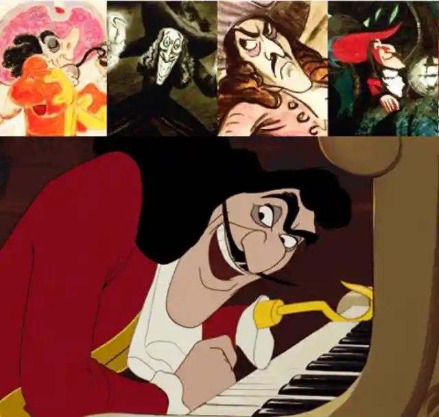

Walt Disney insisted on keeping Hook alive, as he said: > "The audience will get to liking Hook, and they don't want to see him killed." > We were meant to understand his struggle, after all Peter Pan cut his hand and fed it to a crocodile, which now relentlessly follows him everywhere in hopes to eat the rest of him. This made many of us side with him when watching the movie, especially considering the rest of the cast was not as likable or entertaining and him, and the movie had many racial issues. This made that for many, Captain Hook was the saving grace, or even the sole reason, for watching this film.
You probably wonder who is this character, as the name was never given in the canon. Much better known as the Evil Stepmother, Lady Tremaine is the main antagonist in Cinderella. In this case, it was clear from the beginning that the animators were looking for a typical governess design. Serious, uninterested, impossible to reason with. This character needed to transmit that the comfort and happiness of her stepdaughter were the last things on her mind.
#3 - The Genie - Aladdin
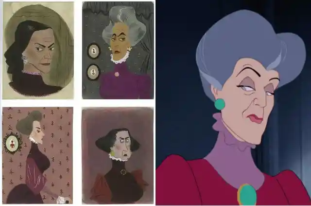

> "A cruel, cold, and calculating tyrant, Lady Tremaine wants nothing more than her daughters to succeed. Unlike most Disney villains, who sport fiery personalities and desire power and the spotlight, she possesses a more cunning, subtle, passive-aggressive personality with a shrewd intelligence and ability for manipulation" The only interests of this character is to get an easy life through her daughters, and she will do anything to achieve it.
It makes us wonder if, almost twenty years ago, the creators of The Genie knew they were about to make the greatest, most memorable, fun and charming character of all times. If not, congratulations anyway. Because this character made history, and is forever remembered as one of the most beloved in the Disney Canon. Even more surprising is that Eric Goldberg, the main person behind Genie´s creation, was a fresh face in the Disney Studios. Many claim that it shows how his cheerful personality and humor can be recognised into the character.
#2 - Elsa and Anna - Frozen

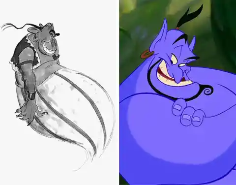
He was mainly inspired by famous caricaturist Al Hirschfeld for the style of The Genie, and once the design was set, everyone agreed that Robin Williams just HAD TO play the role. And, for this, they had a plan: They took several clips of Robin Williams comedic sketches, and animated The Genie doing the acts. This completely convinced the actor into taking the voice role, which would end up becoming his most memorable role ever.
This entry and the next are dedicated to the two most popular sisters of the last decade, and main characters of the highest grossing animated film of all time: Elsa and Anna, from Frozen. But first, we really should address the elephant in the room: With the current trend of using 3D graphics for every single Disney movie ever since Tangled, the House Style should be no more, as the characters are designed in a completely different way: In 3D animation, the characters are individually modeled in full body, and then rigged (putting invisible elements that indicate how characters can move and articulate their bodies). Finally, they are given colors and patterns. For this reason, you only need to draw each character once (but of course every costume or hairstyle change needs a new model.).
#1 - Elsa and Anna (END) - Frozen
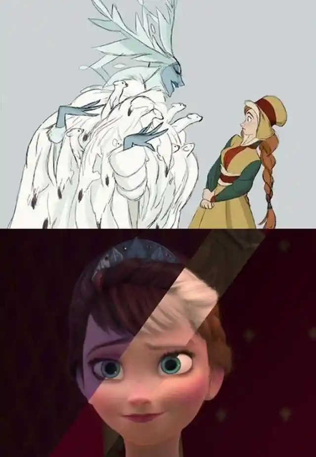
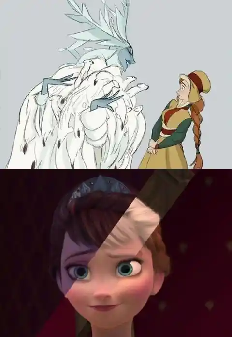
Because of this 3D characters have the ADVANTAGE of being as decorated and elaborated as they wish to be, as the animators no longer have to draw every single freckle and clothing pattern on every single frame... And then, we are given two NON twin sisters, who are identical to each other, and THEIR mother. Sans the hair colors. The fans are, not happy... But, how did we get to this?? Let´s move to next, and final entry.
The story of Frozen is based on the fairytale The Snow Queen, which had a very faithful Soviet adaptation in the 50s, by the way. It tells the story of how Kai, a child, offended the Snow Queen, and she took him with her and froze his heart. Gerda, Kai´s best friend, went on a quest to face the Queen and rescue him. In the original story, the Queen and Gerda were not related. .Up to this point, the Queen was given many wonderful, vivid, magnificent designs, all of them too good, choosing was certainly hard...


The Snow Queen was, in fact, a story Walt Disney himself attempted to adapt in many occasions, but never quite getting it right. Long after his death, directors Buck and Lee finally solved one of the struggles, and decided to make the main characters related. From this point on, The Queen would be Elsa, and Gerda would be Anna., and they would be sisters. This changed everything. This, sadly, meant that many of the designs wouldn´t work out, as the way in which Elsa develops and (fails to) control her powers would have to be completely different. She had to look human, just like her sister. But maybe too much.