Victoria’s Secret Fail
Most girls love wearing nice lingerie. The majority of them would kill for a fine Victoria’s Secret bra. Red and pink are the preferred colors when choosing lingerie. When entering the store, you want to take everything with you until you see this weird underwear.
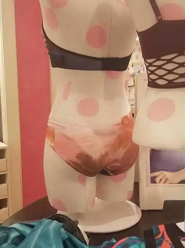
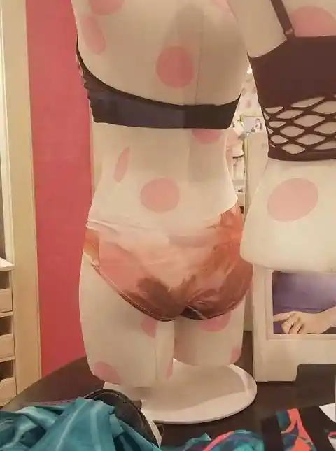
The business must have hired a new clothing designer who’s learning and getting experience. We’re not judging; we’ve all gone through that stage. Unfortunately, this designer has created underwear that looks like someone’s pooped on it.
Watermark
Some designs are on the Internet with a watermark crossing it over so people won’t use the design unless they pay for it. In this case, someone dared to use a design that had the Shutterstock watermark and didn’t care at all.

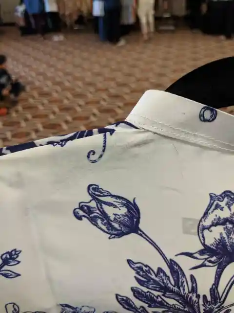
Not only did they steal the design, but they also printed on the shirt with the Shutterstock watermark. The manufacturers could get in legal trouble for this, as this piece of clothing is a ground for a lawsuit.
Worst Bikini Design
Minions are supposed to be silly, so silly that they are funny too. In the film, hundreds of little yellow mini villains try so hard to be the bad guys, but in fact, they are just dummies.

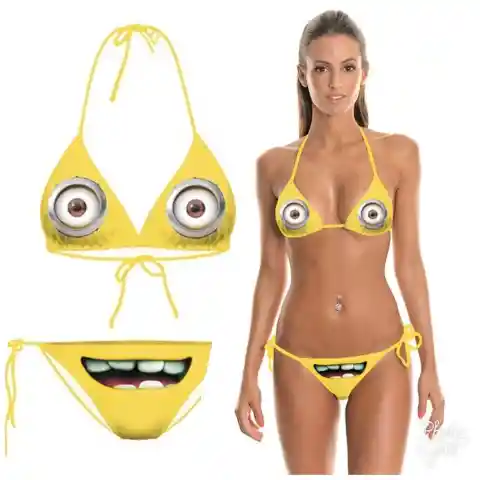
Even though it’s a kids' movie, adults have fun with minions too. Some yellow t-shirts with a minion eye on them are pretty cool. What’s not cool is this bikini, which has eyes on the top and mouth on the bottom. Suddenly, it isn’t funny anymore.
Pineapples And Watermelons
Everybody knows the difference between a pineapple and a watermelon, except for this t-shirt designer. Maybe this design was meant to be on purpose, or maybe the designer mixed the fruits without noticing.
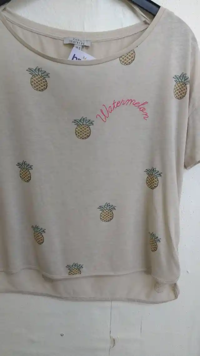
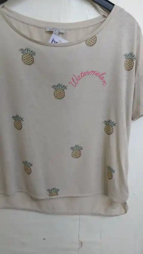
A t-shirt full of pineapples has the word watermelon on the left. Maybe it’s just ironic. Or maybe someone was trying to be funny, as the pineapples look weird and rounded. Either way, people are still buying it.
Opposite Direction
If you refuse to sink, like the t-shirt reads, it means that you want to stay afloat, safe and sound. Why does this colorful marine t-shirt imply just the opposite?
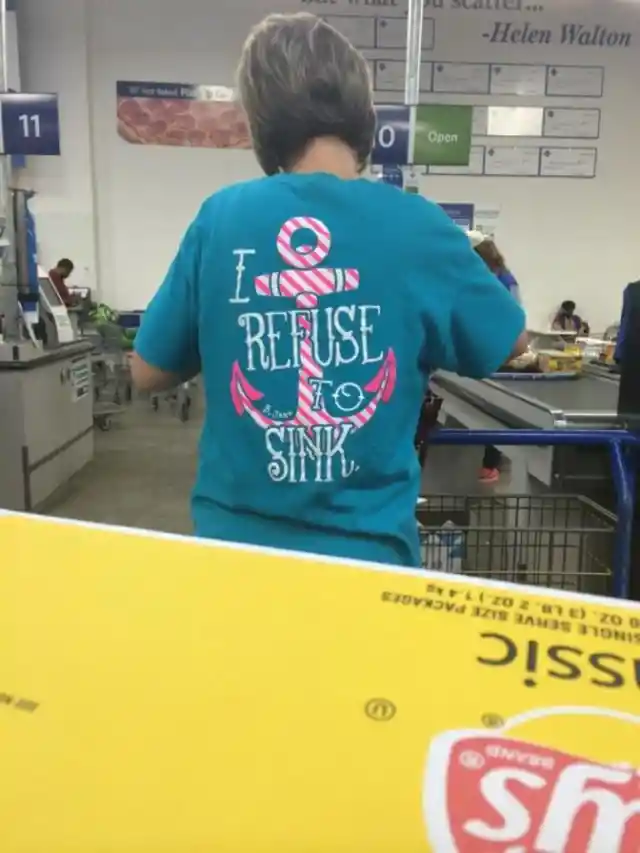
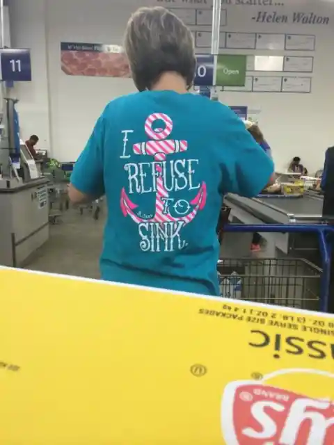
Anchors have one job: to sink. It’s hard to understand the mind of this designer, as he or she designed a motivational phrase with an anchor, and the two of them refer to the opposite. It sounds quite depressing.
Pedo
Comedian and actor Kevin Hart makes us laugh every time. Now he makes us laugh for wearing a t-shirt that reads fart in Spanish. Probably he didn’t notice at all, or maybe he’s just being funny.
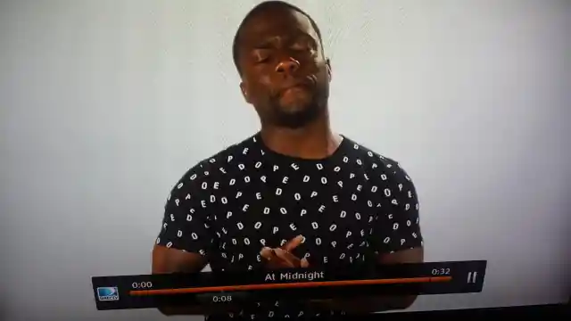

The funniest part is that this t-shirt is supposed to read dope, but now all we can spot is pedo. This designer has missed all his Spanish lessons, and now we can’t stop laughing at it.
Pocket Fail
Clothes that have manufacturing problems are usually on sale or under huge discounts. Manufacturers won’t throw clothes away so they rather sell them at a lower price to cover costs. However, some clothes shouldn't even leave the factory.

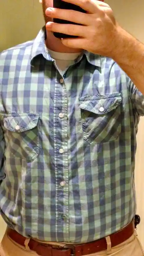
This shirt probably looked perfect in the store. The pattern and the colors are fine, but the pockets aren’t. Someone wasn’t having a good day when sewing this shirt’s pockets.
Error 404: No Designing Connection
This t-shirt is so confusing and bizarre that we can’t really understand the meaning. It’s hard to imagine what was going on in the designer’s head when creating this piece of clothing.
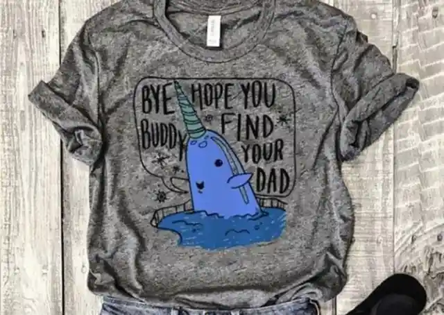
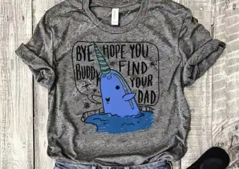
It just raises so many questions, Who are you talking to? Why do I have to find my dad? Why is a whale unicorn talking? Buddy, I expect another t-shirt to answer all these doubts.
Bizarre Mario
Items meant for kids won’t succeed in the market if they look scary or threatening. This coat was meant to look like Mario Bros, but it looks like a middle-aged man ready to start his job at a manual factory.
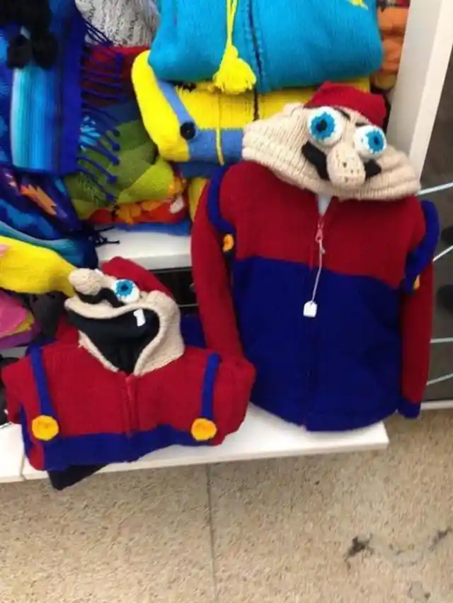

Even though it’s a crafted product, it can’t be denied how scary it is. Not even a true and passionate fan of Mario Bros would ask his or her parents to buy it for them.
Take A Fart
When looking at this photo, it’s difficult to concentrate on the great designs when there’s a word that reads fart on one of them. It’s a shame that such great inspirational quotes aren’t appreciated for one silly mistake.

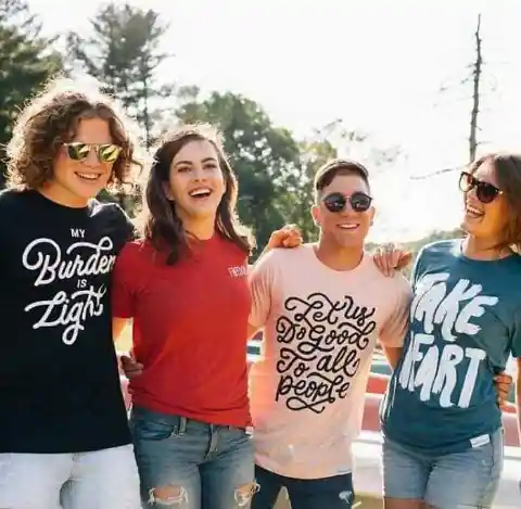
People behind the camera should’ve checked it, but they didn’t. Now we have an amazing product out in the market, but the selling image just reads fart.
Here Comes The… Oh
You’re a teenager, it’s summer, and the Jump Rope Camp is just around the corner. Your parents buy you a t-shirt from the camp to calm down your anxiety about being there. You just can’t wait. Until you see the t-shirt design.

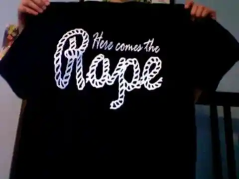
Let’s give some credit to the idea for the camp logo, as it wasn’t that bad. Writing rope in italics with a rope-like font is great, but mistaking an o for an a is so bad that I would personally go find another summer camp.
Ripped Jeans
Ripped jeans are a trend now. Everybody wears ripped jeans. But we don’t know who would wear jeans that are so torn out that it has left nothing at all. They don’t even cover your butt. At least it has pockets.

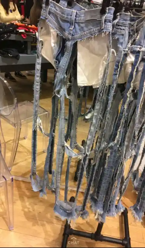
Don’t miss this great opportunity! Ripped jeans that look like pants, but they’re just pantless for only $168. It’s a good price if you are looking for some pants to wear in the hot summer.
Don’t Try To Be Original
Something original refers to a new creation by an artist, not a copy. Some designers want so badly to be original that they make silly mistakes. This t-shirt is a clear example of this.
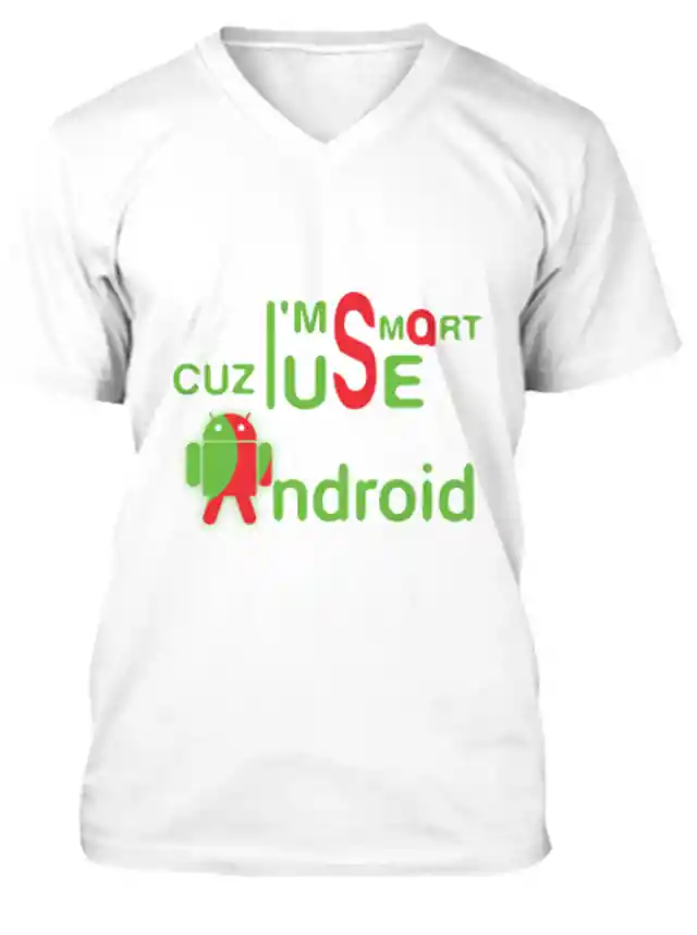

If a design is hard to read because the designer changed the normal order of reading, well, it would result in a mess. Not only does it have a problem with the word order, but with letters too. Why is a Q replacing an A? The whole design doesn’t make sense at all.
This Is Suicidal
Parents love buying their little ones clothing that has cute phrases stamped on it. This little t-shirt looks cute if you read the word Foodie, but it isn’t as cute as the designer thought it would be.

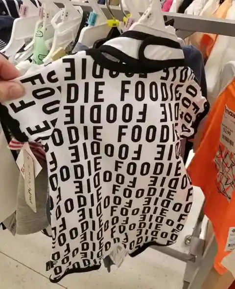
The word Foodie is not complete in some parts of the t-shirt. The designer filled in the gaps with part of the word. As a result, you can read die in some corners. This suicidal piece of clothing won’t appeal to any parent at all.
Half Dinosaur
When designing a piece of clothing like shorts, it is important to have in mind the sewing parts. However, it can be difficult to predict how manufacturers would create the product. The production may vary from the original idea sometimes.
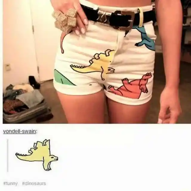

This short seems to have a problem with the design. The problem is that it’s so obvious that it turns out to be funny. The dinosaur is missing two legs and half body, and the memes are hilarious.
School Is Hell
The first day of school is certainly a mix of emotions, not only for kids but also for parents. The children see their friends and play, while parents see their child growing and also get some time for themselves during those hours.


But not all kids feel the same about school. Some hate it. This little girl wears a sweatshirt that reads Hello, but we can only read Hell from this angle. Is this a sign or just a funny coincidence?
NOT-To-Do’s
This schedule is exactly what you don’t have to do in your daily routine. According to this t-shirt, you wake up early in the morning, but you wait almost two hours to have a cup of coffee. Then you wait 25 minutes to eat solid.

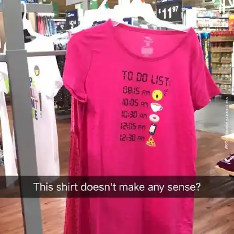
There’s more to it. After you have a donut for breakfast at 10:30 am, you have a slice of pizza two hours later. Hopefully, the design ends there. Let’s not imagine what else could have this designer planned for the rest of the day.
Measuring Gone Wrong
Measures are extremely important when designing clothes. It depends on the type of design. Usually, if you get them wrong, it results in a lame design, such as this picture.
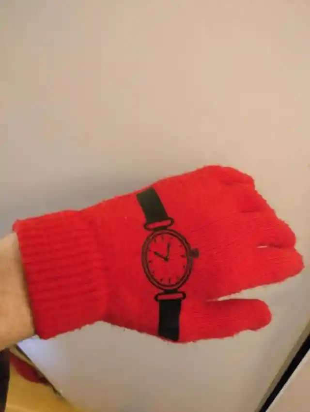

Red gloves with a watch on them. The idea’s cool, but the result isn’t. If you design a watch on some gloves, they are supposed to be on the wrist, not the hand. These would’ve been good gloves if it wasn’t for the measuring problem.
Geographically Lost
It seems that someone is missing a compass here. This surfing-style sleeveless shirt has a pleasing design on it. The stamping looks exceptional and the color of the clothing is modern. However, there’s something wrong with it.
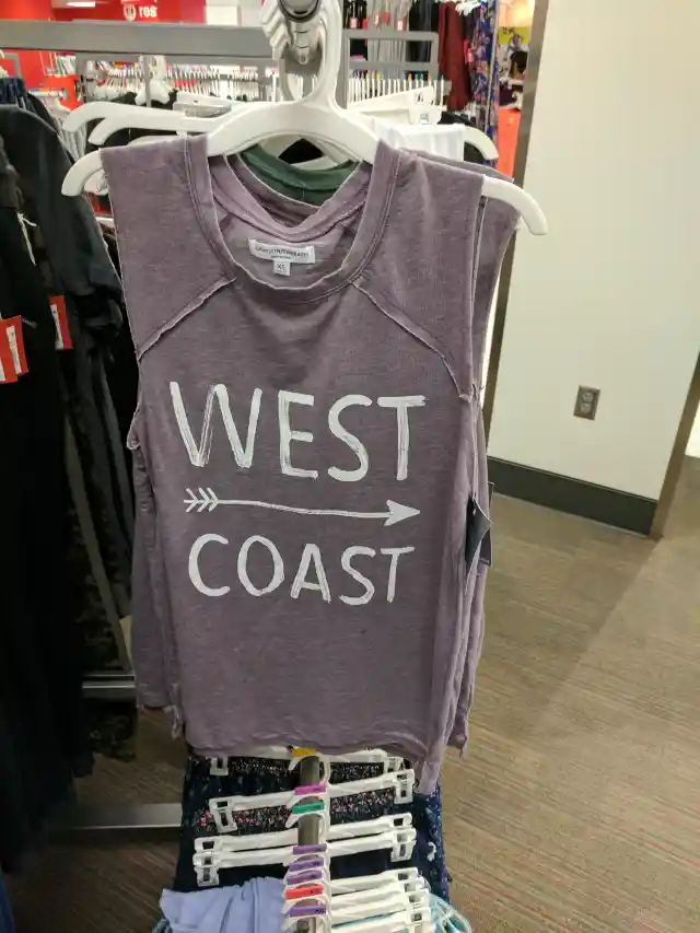

The designer must have spent hours working on this piece of clothing, except that he or she didn’t check where the West actually is. FYI, if you point to the right, you are referring to the East Coast. Someone didn’t pass Geography at school.
Sewing Problems
There are many reasons why this t-shirt is sewed in this way. Maybe the creator of this t-shirt is probably joking with us, or he or she ran out of fabric, or it was designed on purpose.
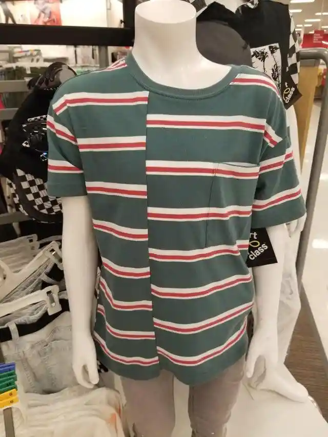
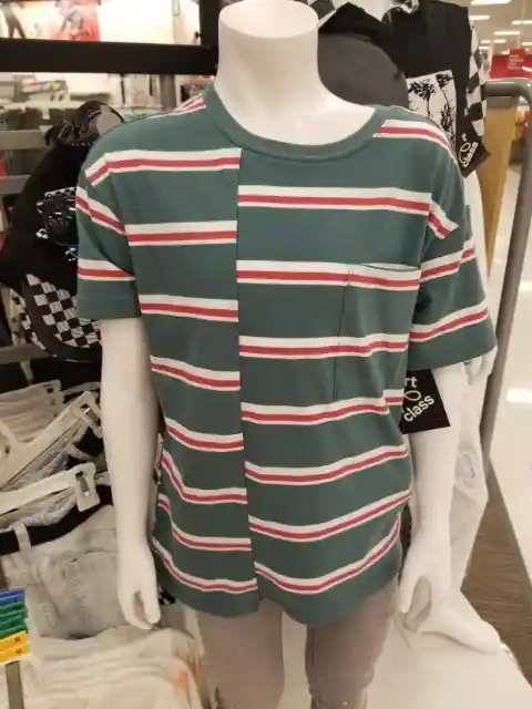
It can’t be designed on purpose; it doesn’t make sense at all. The t-shirt gives the impression that they were rushing with the delivery date and had no time, so this is the result.
Giant Baby
Let’s consider this baby suit an inclusive piece of clothing. Even though it doesn’t make sense to design a baby suit that says My First Birthday in a 24-month-old size, it was probably aimed at big giant babies.

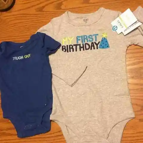
No kidding here. Some babies are way bigger and they need bigger clothes. It may not look normal for a 12-month-old baby to wear a 24-month-old size, but designers have taken into account giant babies when designing it.
Fake Storm Troopers
Star Wars fans buy any merchandise and clothing related to their favorite movie. Here, this guy bought Storm Trooper socks to add to his Star Wars collection, except that the image of Storm Troopers disappears when you wear it.
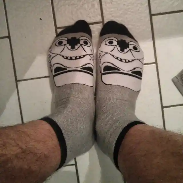
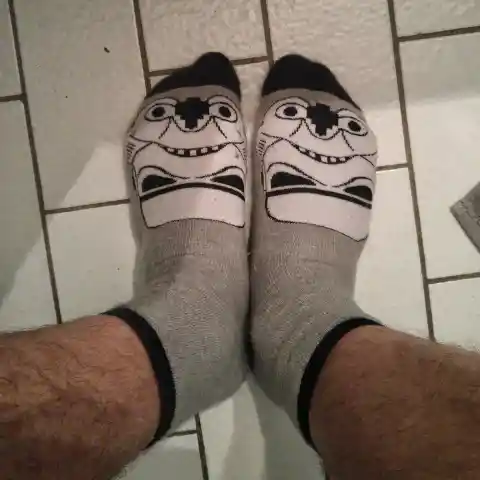
Socks are usually hanging in stores so people can appreciate the design. If these socks were upside down, no one would’ve bought them. The guy bought them but found them quite funny if you look at them from another angle.
Nonsense
Probably the creator of the t-shirt is having a problem with color combinations. This person created a t-shirt that has a ridiculous phrase stamped on it. It’s hard to understand how it actually got sold.
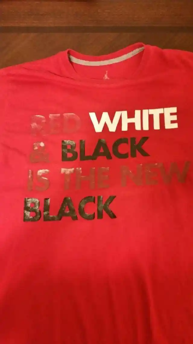

The t-shirt is red, and part of the writing is also in red, so it’s difficult to read it. Apart from a wrong color decision, the creator didn’t even consider the meaning of the phrase. Who would wear it? Probably no one.
White And Black, Combined
If you deeply analyze this t-shirt, it’s clear that some originality points must be given. Designing something that stands out isn’t easy at all. This piece of clothing makes you stand out, somehow.
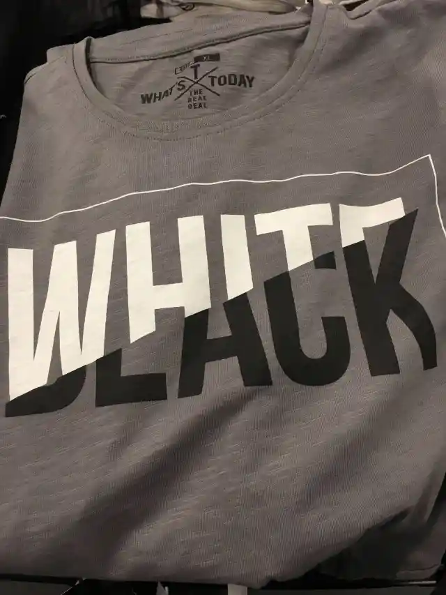

The combination of white and black has a good impression but a weird result. If you look closely, a word is formed: Whack. Someone, somewhere on this planet, would definitely go for it. Have faith.
Mechanic Pants
Some pants are designed to have a tearing effect, like torn jeans. These pants were probably designed to have the same effect, except that it just looks like mechanic's pants.

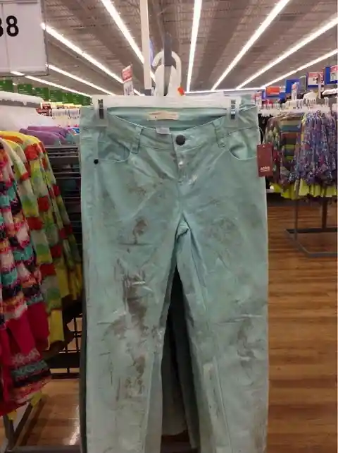
It may be hard to believe, but these pants were sold at Walmart. Someone who’s into green would probably like some oil-stained-looking pants.
Luck Girl
“Hey! Let’s do a Luck Girl t-shirt with the original Coca-Cola font,” is what the designer of this sweatshirt may have thought. Wrong! If you search on the internet, you’ll find over a million fonts to choose whichever appeals to you.
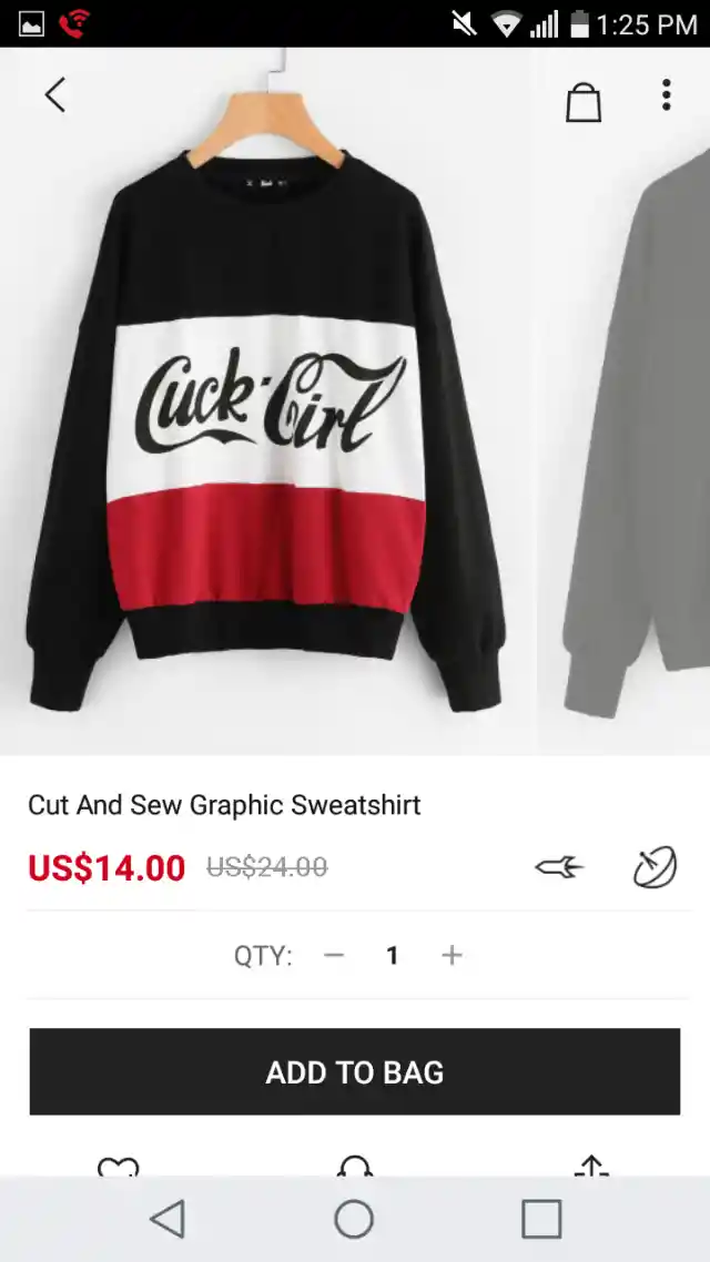

Choosing the Coca-Cola font has led this designer to a bad luck sweatshirt, as this item reads “Cuck Girl.” This silly mistake is probably the reason why this piece of clothing is on sale. No one wants it.
Jacket Designers, Beware
This woman is wearing a fine white jacket that looks great on her if it weren’t for those pockets. The person who designed the jacket didn’t consider that placing rounded pockets with a bottom in the center of it won’t look cool.
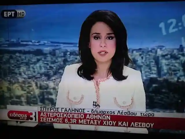
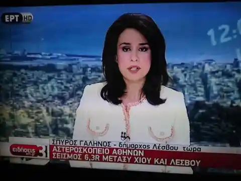
The news anchor probably didn’t notice at all, but we do. The pockets look like boobies from that angle. Maybe if the camera was placed a little bit lower or from another angle, we wouldn’t have noticed at all.
It’s Not What It Looks Like…
Black and nude are great colors for a party dress. However, when you put both colors in a piece of clothing and the nude part is in the center of it, everything may get a little misleading.
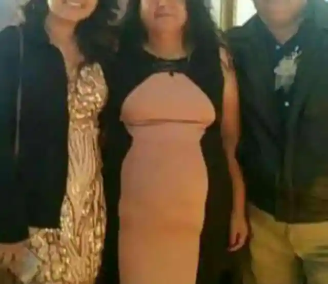

This dress may look amazing in the store. But when you wear it it’s a completely different story, as it looks like a giant penis. If only she had tried it on before buying it. This woman has a clean mind and doesn’t notice the similarity.
So Confusing
Why is a good idea always ruined by some silly mistake? We will never know. As for this t-shirt, it’s not a matter of not knowing the numbers. Someone made a typo and decided he or she would get away with it.

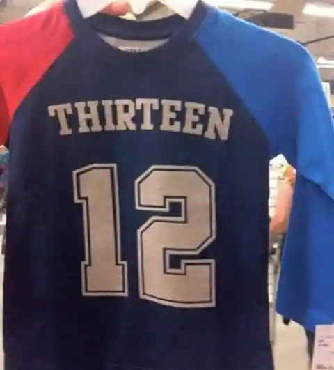
This silly mistake is so obvious that not a single English speaker would buy a t-shirt like this one. Maybe this piece of clothing is sold in other non-English speaking countries. If they don’t understand the word, it’s just fine. It’s a good design if we take out the meaning.
Crossword Gone Wrong
The idea of making a crossword design is that the words on it form an important word. The designer tried so hard to make the word Berlin fit into that he came up with the alphabet, except that it’s not.
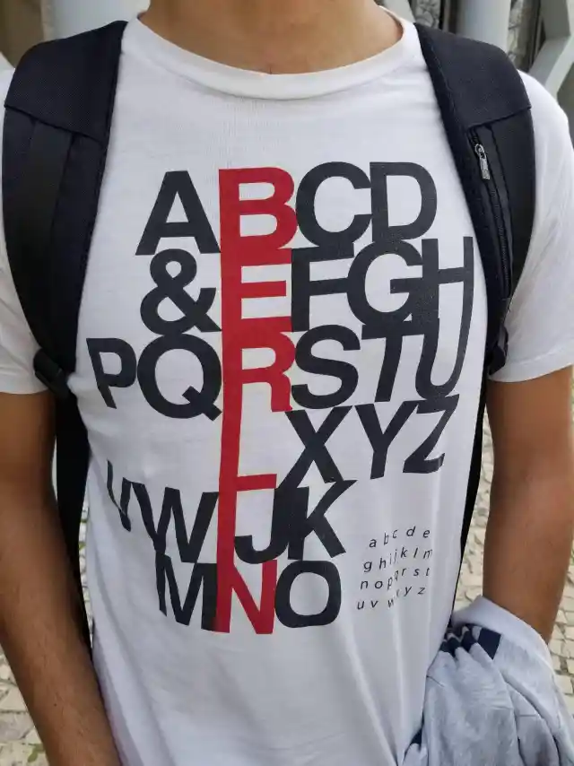

Tourists looking for a t-shirt in Berlin would definitely buy one of this kind. But who would buy a t-shirt that has a messy alphabet? Maybe people from Russia or Ukraine, people who don’t use our alphabet or have no idea of the real order of letters.